> ## Documentation Index
> Fetch the complete documentation index at: https://subframe-59800133-gtmbot-restructure-dark-mode-docs-v2.mintlify.site/llms.txt
> Use this file to discover all available pages before exploring further.
# Overview
> Reusable UI building blocks for your designs.
Components let you reuse UI across your designs.
* **Same as code** — Components in Subframe are the same building blocks your engineers use
* **Always in sync** — When you update a component, all instances update and sync to code
* **Interactive when needed** — Some components like checkboxes and accordions have built-in interaction logic using `@subframe/core`, our Radix-based headless component library. Learn more about [headless components](/concepts/code-generation#headless-components).
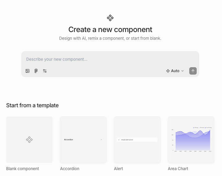 ## Importing components
We recommend [importing your theme](/learn/theme/importing-tokens) first so that imported components match your design system.
1. Navigate to **Components** in navbar
2. Click **New component**
3. Paste the source code of an existing component from your codebase into the prompt
4. Press Enter or click the send button — the AI agent will take a few minutes to import your component
```
Recreate the Button component from the following code:
import * as React from "react"
import { cva, type VariantProps } from "class-variance-authority"
import { Slot } from "radix-ui"
import { cn } from "@/lib/utils"
const buttonVariants = cva(
"focus-visible:border-ring focus-visible:ring-ring/50 aria-invalid:ring-destructive/20 dark:aria-invalid:ring-destructive/40 aria-invalid:border-destructive dark:aria-invalid:border-destructive/50 rounded-lg border border-transparent bg-clip-padding text-sm font-medium focus-visible:ring-3 aria-invalid:ring-3 [&_svg:not([class*='size-'])]:size-4 group/button inline-flex shrink-0 items-center justify-center whitespace-nowrap transition-all outline-none select-none disabled:pointer-events-none disabled:opacity-50 [&_svg]:pointer-events-none [&_svg]:shrink-0",
{
variants: {
variant: {
default: "bg-primary text-primary-foreground [a]:hover:bg-primary/80",
outline: "border-border bg-background hover:bg-muted hover:text-foreground dark:bg-input/30 dark:border-input dark:hover:bg-input/50 aria-expanded:bg-muted aria-expanded:text-foreground",
secondary: "bg-secondary text-secondary-foreground hover:bg-secondary/80 aria-expanded:bg-secondary aria-expanded:text-secondary-foreground",
ghost: "hover:bg-muted hover:text-foreground dark:hover:bg-muted/50 aria-expanded:bg-muted aria-expanded:text-foreground",
destructive: "bg-destructive/10 hover:bg-destructive/20 focus-visible:ring-destructive/20 dark:focus-visible:ring-destructive/40 dark:bg-destructive/20 text-destructive focus-visible:border-destructive/40 dark:hover:bg-destructive/30",
link: "text-primary underline-offset-4 hover:underline",
},
size: {
default: "h-8 gap-1.5 px-2.5 has-data-[icon=inline-end]:pr-2 has-data-[icon=inline-start]:pl-2",
xs: "h-6 gap-1 rounded-[min(var(--radius-md),10px)] px-2 text-xs in-data-[slot=button-group]:rounded-lg has-data-[icon=inline-end]:pr-1.5 has-data-[icon=inline-start]:pl-1.5 [&_svg:not([class*='size-'])]:size-3",
sm: "h-7 gap-1 rounded-[min(var(--radius-md),12px)] px-2.5 text-[0.8rem] in-data-[slot=button-group]:rounded-lg has-data-[icon=inline-end]:pr-1.5 has-data-[icon=inline-start]:pl-1.5 [&_svg:not([class*='size-'])]:size-3.5",
lg: "h-9 gap-1.5 px-2.5 has-data-[icon=inline-end]:pr-3 has-data-[icon=inline-start]:pl-3",
icon: "size-8",
"icon-xs": "size-6 rounded-[min(var(--radius-md),10px)] in-data-[slot=button-group]:rounded-lg [&_svg:not([class*='size-'])]:size-3",
"icon-sm": "size-7 rounded-[min(var(--radius-md),12px)] in-data-[slot=button-group]:rounded-lg",
"icon-lg": "size-9",
},
},
defaultVariants: {
variant: "default",
size: "default",
},
}
)
function Button({
className,
variant = "default",
size = "default",
asChild = false,
...props
}: React.ComponentProps<"button"> &
VariantProps & {
asChild?: boolean
}) {
const Comp = asChild ? Slot.Root : "button"
return (
)
}
export { Button, buttonVariants }
```
1. Navigate to **Components** in navbar
2. Click **New component**
3. Take a screenshot of the component and its states from Figma and paste it into the prompt
4. Press Enter or click the send button — the AI agent will take a few minutes to import your component
## Creating components using AI
1. Navigate to **Components** in navbar
2. Click **New component**
3. Describe the component you want in the prompt
4. Press Enter or click the send button — the AI agent will take a few minutes to create your component
## Creating components from scratch
1. Navigate to **Components** in navbar
2. Click **New component**
3. Choose one of:
* Remix an existing prebuilt component
* Create from scratch
Some prebuilt components are based off of Radix primitives. If you want interactive logic like checked state, you must
remix an existing prebuilt component.
## Creating components from existing designs
## Importing components
We recommend [importing your theme](/learn/theme/importing-tokens) first so that imported components match your design system.
1. Navigate to **Components** in navbar
2. Click **New component**
3. Paste the source code of an existing component from your codebase into the prompt
4. Press Enter or click the send button — the AI agent will take a few minutes to import your component
```
Recreate the Button component from the following code:
import * as React from "react"
import { cva, type VariantProps } from "class-variance-authority"
import { Slot } from "radix-ui"
import { cn } from "@/lib/utils"
const buttonVariants = cva(
"focus-visible:border-ring focus-visible:ring-ring/50 aria-invalid:ring-destructive/20 dark:aria-invalid:ring-destructive/40 aria-invalid:border-destructive dark:aria-invalid:border-destructive/50 rounded-lg border border-transparent bg-clip-padding text-sm font-medium focus-visible:ring-3 aria-invalid:ring-3 [&_svg:not([class*='size-'])]:size-4 group/button inline-flex shrink-0 items-center justify-center whitespace-nowrap transition-all outline-none select-none disabled:pointer-events-none disabled:opacity-50 [&_svg]:pointer-events-none [&_svg]:shrink-0",
{
variants: {
variant: {
default: "bg-primary text-primary-foreground [a]:hover:bg-primary/80",
outline: "border-border bg-background hover:bg-muted hover:text-foreground dark:bg-input/30 dark:border-input dark:hover:bg-input/50 aria-expanded:bg-muted aria-expanded:text-foreground",
secondary: "bg-secondary text-secondary-foreground hover:bg-secondary/80 aria-expanded:bg-secondary aria-expanded:text-secondary-foreground",
ghost: "hover:bg-muted hover:text-foreground dark:hover:bg-muted/50 aria-expanded:bg-muted aria-expanded:text-foreground",
destructive: "bg-destructive/10 hover:bg-destructive/20 focus-visible:ring-destructive/20 dark:focus-visible:ring-destructive/40 dark:bg-destructive/20 text-destructive focus-visible:border-destructive/40 dark:hover:bg-destructive/30",
link: "text-primary underline-offset-4 hover:underline",
},
size: {
default: "h-8 gap-1.5 px-2.5 has-data-[icon=inline-end]:pr-2 has-data-[icon=inline-start]:pl-2",
xs: "h-6 gap-1 rounded-[min(var(--radius-md),10px)] px-2 text-xs in-data-[slot=button-group]:rounded-lg has-data-[icon=inline-end]:pr-1.5 has-data-[icon=inline-start]:pl-1.5 [&_svg:not([class*='size-'])]:size-3",
sm: "h-7 gap-1 rounded-[min(var(--radius-md),12px)] px-2.5 text-[0.8rem] in-data-[slot=button-group]:rounded-lg has-data-[icon=inline-end]:pr-1.5 has-data-[icon=inline-start]:pl-1.5 [&_svg:not([class*='size-'])]:size-3.5",
lg: "h-9 gap-1.5 px-2.5 has-data-[icon=inline-end]:pr-3 has-data-[icon=inline-start]:pl-3",
icon: "size-8",
"icon-xs": "size-6 rounded-[min(var(--radius-md),10px)] in-data-[slot=button-group]:rounded-lg [&_svg:not([class*='size-'])]:size-3",
"icon-sm": "size-7 rounded-[min(var(--radius-md),12px)] in-data-[slot=button-group]:rounded-lg",
"icon-lg": "size-9",
},
},
defaultVariants: {
variant: "default",
size: "default",
},
}
)
function Button({
className,
variant = "default",
size = "default",
asChild = false,
...props
}: React.ComponentProps<"button"> &
VariantProps & {
asChild?: boolean
}) {
const Comp = asChild ? Slot.Root : "button"
return (
)
}
export { Button, buttonVariants }
```
1. Navigate to **Components** in navbar
2. Click **New component**
3. Take a screenshot of the component and its states from Figma and paste it into the prompt
4. Press Enter or click the send button — the AI agent will take a few minutes to import your component
## Creating components using AI
1. Navigate to **Components** in navbar
2. Click **New component**
3. Describe the component you want in the prompt
4. Press Enter or click the send button — the AI agent will take a few minutes to create your component
## Creating components from scratch
1. Navigate to **Components** in navbar
2. Click **New component**
3. Choose one of:
* Remix an existing prebuilt component
* Create from scratch
Some prebuilt components are based off of Radix primitives. If you want interactive logic like checked state, you must
remix an existing prebuilt component.
## Creating components from existing designs
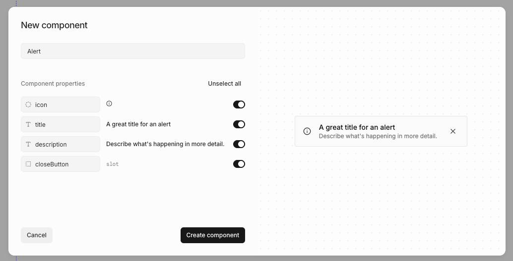 You can create components directly from elements on a page:
1. Right-click or press / to open [quick actions](/learn/design-mode/quick-actions)
2. Select **Create component**
3. Name your component
4. Review AI-suggested properties
5. Click **Create**
Subframe AI will auto-suggest properties using best practices based on what you have selected.
## Editing components
To edit a component:
1. Navigate to **Components** in navbar
2. Click on the component
3. Click **Edit component**
To edit a component from the editor:
1. Right-click or press / to open [quick actions](/learn/design-mode/quick-actions)
2. Select **Edit component**
Any changes you make will update all component instances.
## Adding component instances
You can add a component instance by
1. Open the [quick insert](/learn/design-mode/adding-elements) menu
2. Select the component you want to add
## Detaching component instances
You can detach a component so the rendered elements are no longer linked to the component.
1. Right-click or press / to open [quick actions](/learn/design-mode/quick-actions)
2. Select **Detach component**
Not all components can be detached; interactive components built on Radix (like accordions, checkboxes, etc) cannot be
detached.
## Resetting components
You can reset a prebuilt component to its original state, reverting any customizations you've made.
1. Right-click or press / to open [quick actions](/learn/design-mode/quick-actions)
2. Select **Reset to original**
3. Confirm the reset
This restores the component to its default configuration from the Subframe library.
## Component docs
You can create components directly from elements on a page:
1. Right-click or press / to open [quick actions](/learn/design-mode/quick-actions)
2. Select **Create component**
3. Name your component
4. Review AI-suggested properties
5. Click **Create**
Subframe AI will auto-suggest properties using best practices based on what you have selected.
## Editing components
To edit a component:
1. Navigate to **Components** in navbar
2. Click on the component
3. Click **Edit component**
To edit a component from the editor:
1. Right-click or press / to open [quick actions](/learn/design-mode/quick-actions)
2. Select **Edit component**
Any changes you make will update all component instances.
## Adding component instances
You can add a component instance by
1. Open the [quick insert](/learn/design-mode/adding-elements) menu
2. Select the component you want to add
## Detaching component instances
You can detach a component so the rendered elements are no longer linked to the component.
1. Right-click or press / to open [quick actions](/learn/design-mode/quick-actions)
2. Select **Detach component**
Not all components can be detached; interactive components built on Radix (like accordions, checkboxes, etc) cannot be
detached.
## Resetting components
You can reset a prebuilt component to its original state, reverting any customizations you've made.
1. Right-click or press / to open [quick actions](/learn/design-mode/quick-actions)
2. Select **Reset to original**
3. Confirm the reset
This restores the component to its default configuration from the Subframe library.
## Component docs
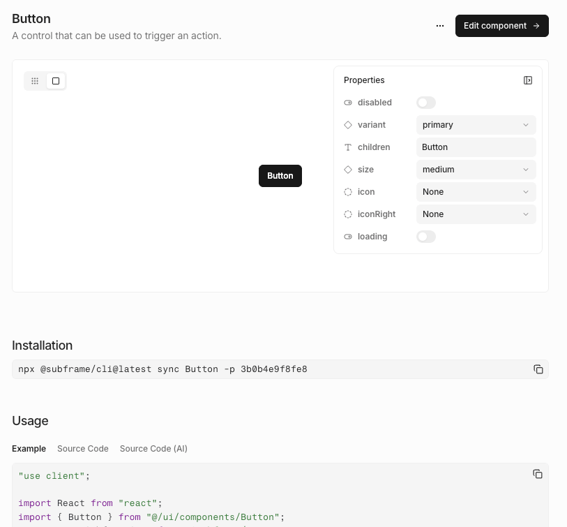 We auto-generate component docs with properties and sometimes examples, similar to Storybook. Any updates you make will automatically update the docs. You can directly edit the component from these docs or send them to a developer.
To view them, navigate to **Components**, click on the component.
## Exporting components to code
We auto-generate component docs with properties and sometimes examples, similar to Storybook. Any updates you make will automatically update the docs. You can directly edit the component from these docs or send them to a developer.
To view them, navigate to **Components**, click on the component.
## Exporting components to code
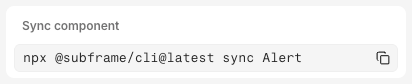 1. Click **Code**
2. Select **Inspect**
3. Copy and paste the `npx @subframe/cli` command
For more information, see [syncing components](/concepts/syncing-components).
## Importing from another project
1. Go to **Components**
2. Click **Import from...** button
3. Select **Another project**
1. Click **Code**
2. Select **Inspect**
3. Copy and paste the `npx @subframe/cli` command
For more information, see [syncing components](/concepts/syncing-components).
## Importing from another project
1. Go to **Components**
2. Click **Import from...** button
3. Select **Another project**